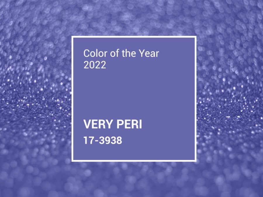
Subtle periwinkle blue. Color of the Year 2022
A powerful year of dynamic changes, 2022 has introduced new hues and palettes in design and textile décor.
The Pantone Color Institute, a provider of professional color language standards and digital solutions for the design community, announced the Color of the Year. For 23 years, the organization has made its selection each year influencing product strategies and palette preferences among interior designers. And for 2022, it’s Very Peri (17-3938), a spritely, romantic, whimsical, lucid and simultaneously very warm periwinkle flower blue.
How did Very Peri become a global trend?
Pantone believes that Very Peri illustrates the fusion of modern life and how color in digital design helps us to stretch the limits of reality, with the expanding popularity of the metaverse and rising artistic community in the digital space.
“Creating a new color for the first time in the history of our Pantone Color of the Year educational color program reflects the global innovation and transformation taking place. As society continues to recognize color as a critical form of communication, and a way to express and affect ideas and emotions and engage and connect, the complexity of this new red violet infused blue hue highlights the expansive possibilities that lay before us”, said Laurie Pressman, Vice President of the Pantone Color Institute.
Enthusiastic and warm, Very Peri resembles the leaves of a periwinkle flower. But what colors are best paired with it?
A periwinkle shade goes beautifully with pink and purple hues — from purple and pale purple to ashen rose and blueberries blue. Very Peri make curious combinations with smoke gray, as well as with the range of gray undertones — from anthracite, warm gray, ashen gray to gray sand and taupe shades.
Very Peri also pairs with similar undertones: light blue, dark blue, blue green, muted mint.
Home décor accents
Periwinkle is an energetic and saturated shade. As far as home interiors go, apply this color moderately, otherwise it will tire your eyes out. It injects a feeling of freshness and energy and is suited to décor, textiles, elements of room design. For instance, textiles in a living room — accent pillows, ornaments on curtains or decorative items (vases, posters, lamps) in periwinkle will dilute a calm natural palette or a monochrome interior in beige and cream tones. They also enliven a space through interior design accents.

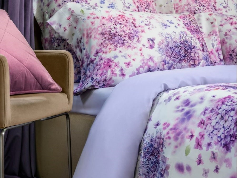
Furnished with decorative textiles or linens in carefree, striking shades of lilac and purple, including Very Peri, a bedroom will evoke an enchanting presence. And when the popularity of the periwinkle color fades, you can replace the bed linen set with a new one in different hues.
This spring Togas introduced a new bedding set, “Estel”, exploring the delicate and fragrant palette of lilac petals: purple, soft lilac, Very Peri, silvery purple.
“Estel” evokes gentleness, femininity, the beauty of spring. The set uses a soft SENSOTEX® fabric made from eucalyptus fibers. The lilac flowers are applied with a watercolor technique featuring blurry and fuzzy contours.
This is an uninhibited, pure and strong color, with its carefree confidence, acts as an intriguing and eye-catching accent in a pattern. Yet it calls for moderate application. Your bedroom can make a novel statement if furnished with curtains featuring such ornaments, stripes or finishes and echoing the bed linens or decorative pillows on the bed.
Pure and playful, periwinkle will look just as great in a children's room. It will enliven the interior, fill the space with positive energy. A baby blanket or a bright throw, an accent wall with whimsical flowers or a different pattern of this hue will fill the room with cheer and excitement.